


World Energy Outlook
Format:
Interactive Content
c.2011
Fig 229a.
National Geographic
World Energy Outlook
World Energy Outlook


From sooty black anthracite to the tidal forces of the oceans themselves, the fuels humans harness to power their ambitions are weighted and measured using this wonder of the information age.
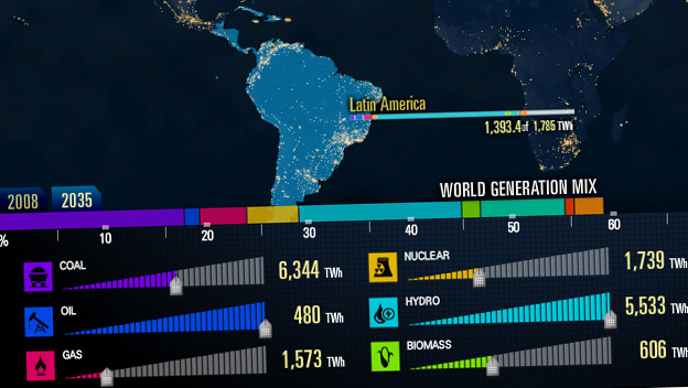
Where does the world's electricity come from? This interactive info-graphic endeavors to raise awareness of our world's energy generation for the next twenty-five years. Expanding beyond petrol, visitors can examine the contributions to the energy footprint made by alternative energy sources like hydro, solar, and wind power. They can also explore the data by removing or changing fuel sources and seeing the resulting impact to the world's energy mix.
The Challenge
We were charged with (pun intended) taking the complex measures of global energy production and envisioning a way for visitors interact with complex data from the International Energy Agency. Our goal was to have the visitor walk away with a better understanding of the diversity and contribution of the world's primary energy fuel sources.
The Solution
We created an interactive application that begins with a view of the world from space. The entire planet is seen at night,. Glistening cities of light reflect electricity generation for six key regions of the world. Energy resources are separated by nine major fuel types: coal, oil, gas, nuclear, hydro, biomass, wind, geothermal, and solar. Visitors can zoom from the world view to inspect a region or country's individual contribution. Along with the measurements, additional facts and related energy links allow the visitor to dive deeper. The usage of each fuel type can be lowered to show how each country is affected if the availability of any fuel type is diminished.
The Success
The interactive served as an essential part of National Geographic's effort to boost interactivity on their Energy page, and is a significant contributor both in terms of traffic and in terms of increasing time spent on the site. It lends a compelling, visual component to a topic that has historically been difficult to illustrate and challenging to engage visitors with. It's share-ability, too, was a key element. When National Geographic sent the interactive out over Twitter, it performed leaps and bounds better than the average tweet.

